

05: Visualisation for Cyber Security
In this session we will cover:
- What different forms of visualisation exist and how are these best utilised?
- How can visualisation be used for cyber security analytics?
- What are the current developments in visualisation research for cyber security?
(Use Jupyter Notebook with RISE for interactive examples)
Visualisation Techniques
Here we will give a brief overview of different visualisation techniques, highlighting where they are effective and how they should be used.
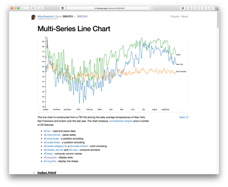
- Most effective for time-series data (x-axis time, y-axis some numerical attribute(s)).
- Need to consider scale - linear/logerithmic/etc.
In [41]:
# https://matplotlib.org/devdocs/gallery/lines_bars_and_markers/simple_plot.html

import matplotlib.pyplot as plt
import numpy as np

# Data for plotting
t = np.arange(0.0, 2.0, 0.01)
s = 1 + np.sin(2 * np.pi * t)

fig, ax = plt.subplots()
ax.plot(t, s)

ax.set(xlabel='time (s)', ylabel='voltage (mV)',
       title='About as simple as it gets, folks')
ax.grid()

#fig.savefig("test.png")
plt.show()