05: Visualisation for Cyber Security
In this session we will cover:
- What different forms of visualisation exist and how are these best utilised?
- How can visualisation be used for cyber security analytics?
- What are the current developments in visualisation research for cyber security?
(Use Jupyter Notebook with RISE for interactive examples)
Visualisation Techniques
Here we will give a brief overview of different visualisation techniques, highlighting where they are effective and how they should be used.
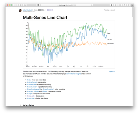
- Most effective for time-series data (x-axis time, y-axis some numerical attribute(s)).
- Need to consider scale - linear/logerithmic/etc.
# https://matplotlib.org/devdocs/gallery/lines_bars_and_markers/simple_plot.html

import matplotlib.pyplot as plt
import numpy as np

# Data for plotting
t = np.arange(0.0, 2.0, 0.01)
s = 1 + np.sin(2 * np.pi * t)

fig, ax = plt.subplots()
ax.plot(t, s)

ax.set(xlabel='time (s)', ylabel='voltage (mV)',
       title='About as simple as it gets, folks')
ax.grid()

#fig.savefig("test.png")
plt.show()
#https://matplotlib.org/devdocs/gallery/lines_bars_and_markers/barchart.html#sphx-glr-gallery-lines-bars-and-markers-barchart-py

import matplotlib.pyplot as plt
import numpy as np

species = ("Adelie", "Chinstrap", "Gentoo")
penguin_means = {
    'Bill Depth': (18.35, 18.43, 14.98),
    'Bill Length': (38.79, 48.83, 47.50),
    'Flipper Length': (189.95, 195.82, 217.19),
}

x = np.arange(len(species))  # the label locations
width = 0.25  # the width of the bars
multiplier = 0

fig, ax = plt.subplots(constrained_layout=True)

for attribute, measurement in penguin_means.items():
    offset = width * multiplier
    rects = ax.bar(x + offset, measurement, width, label=attribute)
    ax.bar_label(rects, padding=3)
    multiplier += 1

# Add some text for labels, title and custom x-axis tick labels, etc.
ax.set_ylabel('Length (mm)')
ax.set_title('Penguin attributes by species')
ax.set_xticks(x + width, species)
ax.legend(loc='upper left')
ax.set_ylim(0, 250)
plt.show()
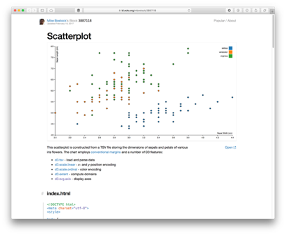
- Comparison between two (or more) different numerical attributes together.
- Helps to identify the relationship (correlation) between two indendepent variables.
- Scale up to multiple attributes using Scatter plot matrix
np.random.seed(42)
N = 50
x = np.random.rand(N)
y = np.random.rand(N)
colors = np.random.rand(N)
area = (30 * np.random.rand(N))**2  # 0 to 15 point radii
plt.scatter(x, y, s=area, c=colors, alpha=0.5)
plt.show()
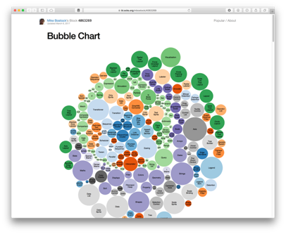
- Essentially a bar chart, but using area rather than height.
- Possibly more engaging for audience, is it more effective for conveying information?
- How is data mapped? By diameter? By radius? Possibly misleading.
# https://matplotlib.org/devdocs/gallery/misc/packed_bubbles.html

import numpy as np
import matplotlib.pyplot as plt

browser_market_share = {
    'browsers': ['firefox', 'chrome', 'safari', 'edge', 'ie', 'opera'],
    'market_share': [8.61, 69.55, 8.36, 4.12, 2.76, 2.43],
    'color': ['#5A69AF', '#579E65', '#F9C784', '#FC944A', '#F24C00', '#00B825']
}


class BubbleChart:
    def __init__(self, area, bubble_spacing=0):
        """
        Setup for bubble collapse.

        Parameters
        ----------
        area : array-like
            Area of the bubbles.
        bubble_spacing : float, default: 0
            Minimal spacing between bubbles after collapsing.

        Notes
        -----
        If "area" is sorted, the results might look weird.
        """
        area = np.asarray(area)
        r = np.sqrt(area / np.pi)

        self.bubble_spacing = bubble_spacing
        self.bubbles = np.ones((len(area), 4))
        self.bubbles[:, 2] = r
        self.bubbles[:, 3] = area
        self.maxstep = 2 * self.bubbles[:, 2].max() + self.bubble_spacing
        self.step_dist = self.maxstep / 2

        # calculate initial grid layout for bubbles
        length = np.ceil(np.sqrt(len(self.bubbles)))
        grid = np.arange(length) * self.maxstep
        gx, gy = np.meshgrid(grid, grid)
        self.bubbles[:, 0] = gx.flatten()[:len(self.bubbles)]
        self.bubbles[:, 1] = gy.flatten()[:len(self.bubbles)]

        self.com = self.center_of_mass()

    def center_of_mass(self):
        return np.average(
            self.bubbles[:, :2], axis=0, weights=self.bubbles[:, 3]
        )

    def center_distance(self, bubble, bubbles):
        return np.hypot(bubble[0] - bubbles[:, 0],
                        bubble[1] - bubbles[:, 1])

    def outline_distance(self, bubble, bubbles):
        center_distance = self.center_distance(bubble, bubbles)
        return center_distance - bubble[2] - \
            bubbles[:, 2] - self.bubble_spacing

    def check_collisions(self, bubble, bubbles):
        distance = self.outline_distance(bubble, bubbles)
        return len(distance[distance < 0])

    def collides_with(self, bubble, bubbles):
        distance = self.outline_distance(bubble, bubbles)
        idx_min = np.argmin(distance)
        return idx_min if type(idx_min) == np.ndarray else [idx_min]

    def collapse(self, n_iterations=50):
        """
        Move bubbles to the center of mass.

        Parameters
        ----------
        n_iterations : int, default: 50
            Number of moves to perform.
        """
        for _i in range(n_iterations):
            moves = 0
            for i in range(len(self.bubbles)):
                rest_bub = np.delete(self.bubbles, i, 0)
                # try to move directly towards the center of mass
                # direction vector from bubble to the center of mass
                dir_vec = self.com - self.bubbles[i, :2]

                # shorten direction vector to have length of 1
                dir_vec = dir_vec / np.sqrt(dir_vec.dot(dir_vec))

                # calculate new bubble position
                new_point = self.bubbles[i, :2] + dir_vec * self.step_dist
                new_bubble = np.append(new_point, self.bubbles[i, 2:4])

                # check whether new bubble collides with other bubbles
                if not self.check_collisions(new_bubble, rest_bub):
                    self.bubbles[i, :] = new_bubble
                    self.com = self.center_of_mass()
                    moves += 1
                else:
                    # try to move around a bubble that you collide with
                    # find colliding bubble
                    for colliding in self.collides_with(new_bubble, rest_bub):
                        # calculate direction vector
                        dir_vec = rest_bub[colliding, :2] - self.bubbles[i, :2]
                        dir_vec = dir_vec / np.sqrt(dir_vec.dot(dir_vec))
                        # calculate orthogonal vector
                        orth = np.array([dir_vec[1], -dir_vec[0]])
                        # test which direction to go
                        new_point1 = (self.bubbles[i, :2] + orth *
                                      self.step_dist)
                        new_point2 = (self.bubbles[i, :2] - orth *
                                      self.step_dist)
                        dist1 = self.center_distance(
                            self.com, np.array([new_point1]))
                        dist2 = self.center_distance(
                            self.com, np.array([new_point2]))
                        new_point = new_point1 if dist1 < dist2 else new_point2
                        new_bubble = np.append(new_point, self.bubbles[i, 2:4])
                        if not self.check_collisions(new_bubble, rest_bub):
                            self.bubbles[i, :] = new_bubble
                            self.com = self.center_of_mass()

            if moves / len(self.bubbles) < 0.1:
                self.step_dist = self.step_dist / 2

    def plot(self, ax, labels, colors):
        """
        Draw the bubble plot.

        Parameters
        ----------
        ax : matplotlib.axes.Axes
        labels : list
            Labels of the bubbles.
        colors : list
            Colors of the bubbles.
        """
        for i in range(len(self.bubbles)):
            circ = plt.Circle(
                self.bubbles[i, :2], self.bubbles[i, 2], color=colors[i])
            ax.add_patch(circ)
            ax.text(*self.bubbles[i, :2], labels[i],
                    horizontalalignment='center', verticalalignment='center')


bubble_chart = BubbleChart(area=browser_market_share['market_share'],
                           bubble_spacing=0.1)

bubble_chart.collapse()

fig, ax = plt.subplots(subplot_kw=dict(aspect="equal"))
bubble_chart.plot(
    ax, browser_market_share['browsers'], browser_market_share['color'])
ax.axis("off")
ax.relim()
ax.autoscale_view()
ax.set_title('Browser market share')
plt.show()
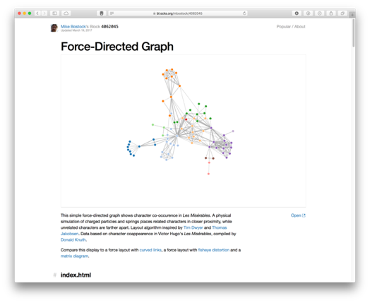
- Node link diagram shows connectivity between entities (e.g., social network, computer network).
- Physics-based layout - no fixed axis.
- Dynamic approach to assess groupings.
- Can result in "hairball" effect if clustering is too great.
# https://plotly.com/python/network-graphs/

import plotly.graph_objects as go

import networkx as nx

G = nx.random_geometric_graph(200, 0.125)

edge_x = []
edge_y = []
for edge in G.edges():
    x0, y0 = G.nodes[edge[0]]['pos']
    x1, y1 = G.nodes[edge[1]]['pos']
    edge_x.append(x0)
    edge_x.append(x1)
    edge_x.append(None)
    edge_y.append(y0)
    edge_y.append(y1)
    edge_y.append(None)

edge_trace = go.Scatter(
    x=edge_x, y=edge_y,
    line=dict(width=0.5, color='#888'),
    hoverinfo='none',
    mode='lines')

node_x = []
node_y = []
for node in G.nodes():
    x, y = G.nodes[node]['pos']
    node_x.append(x)
    node_y.append(y)

node_trace = go.Scatter(
    x=node_x, y=node_y,
    mode='markers',
    hoverinfo='text',
    marker=dict(
        showscale=True,
        # colorscale options
        #'Greys' | 'YlGnBu' | 'Greens' | 'YlOrRd' | 'Bluered' | 'RdBu' |
        #'Reds' | 'Blues' | 'Picnic' | 'Rainbow' | 'Portland' | 'Jet' |
        #'Hot' | 'Blackbody' | 'Earth' | 'Electric' | 'Viridis' |
        colorscale='YlGnBu',
        reversescale=True,
        color=[],
        size=10,
        colorbar=dict(
            thickness=15,
            title='Node Connections',
            xanchor='left',
            titleside='right'
        ),
        line_width=2))

node_adjacencies = []
node_text = []
for node, adjacencies in enumerate(G.adjacency()):
    node_adjacencies.append(len(adjacencies[1]))
    node_text.append('# of connections: '+str(len(adjacencies[1])))

node_trace.marker.color = node_adjacencies
node_trace.text = node_text

fig = go.Figure(data=[edge_trace, node_trace],
             layout=go.Layout(
                title='<br>Network graph made with Python',
                titlefont_size=16,
                showlegend=False,
                hovermode='closest',
                margin=dict(b=20,l=5,r=5,t=40),
                annotations=[ dict(
                    text="Python code: <a href='https://plotly.com/ipython-notebooks/network-graphs/'> https://plotly.com/ipython-notebooks/network-graphs/</a>",
                    showarrow=False,
                    xref="paper", yref="paper",
                    x=0.005, y=-0.002 ) ],
                xaxis=dict(showgrid=False, zeroline=False, showticklabels=False),
                yaxis=dict(showgrid=False, zeroline=False, showticklabels=False))
                )
fig.show()
- High dimensionality - each vertical axis denotes an attribute.
- Can identify correlations.
- What about reordering/highlighting of attributes? Requires interactivity.
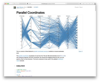
df = pd.read_csv('https://raw.githubusercontent.com/pandas-dev/pandas/main/pandas/tests/io/data/csv/iris.csv')
pd.plotting.parallel_coordinates(df, 'Name', color=('#556270', '#4ECDC4', '#C7F464'))
<AxesSubplot:>
# https://plotly.com/python/parallel-coordinates-plot/

import plotly.graph_objects as go

import pandas as pd

df = pd.read_csv("https://raw.githubusercontent.com/bcdunbar/datasets/master/parcoords_data.csv")

fig = go.Figure(data=
    go.Parcoords(
        line = dict(color = df['colorVal'],
                   colorscale = 'Electric',
                   showscale = True,
                   cmin = -4000,
                   cmax = -100),
        dimensions = list([
            dict(range = [32000,227900],
                 constraintrange = [100000,150000],
                 label = "Block Height", values = df['blockHeight']),
            dict(range = [0,700000],
                 label = 'Block Width', values = df['blockWidth']),
            dict(tickvals = [0,0.5,1,2,3],
                 ticktext = ['A','AB','B','Y','Z'],
                 label = 'Cyclinder Material', values = df['cycMaterial']),
            dict(range = [-1,4],
                 tickvals = [0,1,2,3],
                 label = 'Block Material', values = df['blockMaterial']),
            dict(range = [134,3154],
                 visible = True,
                 label = 'Total Weight', values = df['totalWeight']),
            dict(range = [9,19984],
                 label = 'Assembly Penalty Wt', values = df['assemblyPW']),
            dict(range = [49000,568000],
                 label = 'Height st Width', values = df['HstW'])])
    )
)
fig.show()
# https://plotly.com/python/treemaps/

import plotly.express as px
fig = px.treemap(
    names = ["Eve","Cain", "Seth", "Enos", "Noam", "Abel", "Awan", "Enoch", "Azura"],
    parents = ["", "Eve", "Eve", "Seth", "Seth", "Eve", "Eve", "Awan", "Eve"]
)
fig.update_traces(root_color="lightgrey")
fig.update_layout(margin = dict(t=50, l=25, r=25, b=25))
fig.show()
# https://plotly.com/python/sunburst-charts/
import plotly.express as px
data = dict(
    character=["Eve", "Cain", "Seth", "Enos", "Noam", "Abel", "Awan", "Enoch", "Azura"],
    parent=["", "Eve", "Eve", "Seth", "Seth", "Eve", "Eve", "Awan", "Eve" ],
    value=[10, 14, 12, 10, 2, 6, 6, 4, 4])

fig = px.sunburst(
    data,
    names='character',
    parents='parent',
    values='value',
)
fig.show()
# https://plotly.com/python/radar-chart/

import plotly.express as px
import pandas as pd
df = pd.DataFrame(dict(
    r=[1, 5, 2, 2, 3],
    theta=['processing cost','mechanical properties','chemical stability',
           'thermal stability', 'device integration']))
fig = px.line_polar(df, r='r', theta='theta', line_close=True)
fig.update_traces(fill='toself')
fig.show()
C:\ProgramData\Anaconda3\lib\site-packages\plotly\express\_core.py:271: FutureWarning:

The frame.append method is deprecated and will be removed from pandas in a future version. Use pandas.concat instead.
More Examples
Check out more examples of Plotly online: https://plotly.com/python/
Matplotlib documentation and examples: https://matplotlib.org/stable/index.html
Visualisation for Cyber Security
Visualisation for Cyber Security
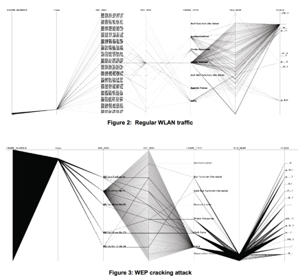
In this example, we see parallel coordinates being used to depict network traffic across a set of 7 attributes. This image shows a comparison between regular wireless network traffic, compared against a WEP key cracking attack against the network. We can see the difference between the two activities clearly in the two images, where essentially the WEP cracking attack is scanning all available ports and uilising a single protocol. The approach is detailed further in the paper, “Visualizing Networking Activity using Parallel Coordinates” by Tricaud et al.
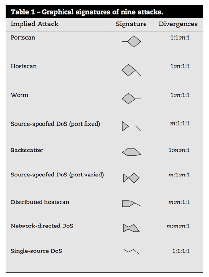
In the paper “Fast detection and visualization of network attacks on parallel coordinates” by Choi et al., they propose the use of parallel coordinates for network traffic analysis, but use this to define small glyphs that are indicative of network behaviours. The distinguishable shape of the data plots can be treated as a signature here, to easily recognise behaivours such as worm, port scan, or DDoS.
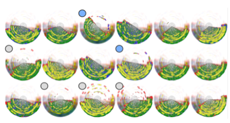
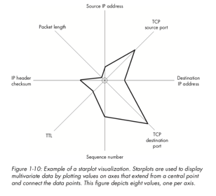
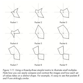
In the example shown here, we have 8 attributes about network packet captures mapped, and so we can show individual packets as glyphs for comparison. Glyphs are widely used in various applications, for example, insider threat detection. This example shows 18 individuals from a company and their behaviours during a 12 month period. Even with such volume data, some differences can be identified (suspicious cases are highlighted with the grey circle, two of these users are denoted in blue as potentially malicious).
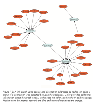
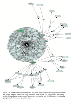
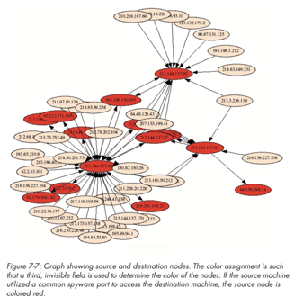
Node-link diagrams for network entity mapping - watch out for hairball effects.
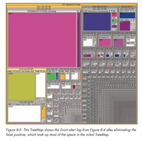
Treemaps were discussed earlier, and here we see snort alerts mapped against a tree map to show the volume of alert types, where alerts will naturally exist as part of a group (i.e., within a hierarchy).
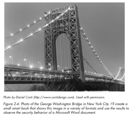
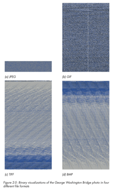
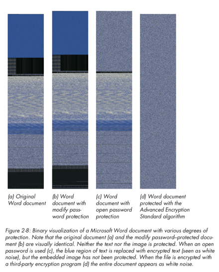
A final example to consider is the use of visualisation for binary file analysis (we will discuss this in further detail later in the course). Greg Conti shows an excellent example of this, where binary data is mappped to pixel values to produce an image of the data. We can examine what the same image may look like using different image compression schemes (e.g., bmp, png, gif, jpeg), as well as how a Microsoft Word document may appear once password-protected or encrypted (here we see that the password-protected file does not encrypt the original data).
VizSec (Visualization for Cyber Security)
- Academic venue for research in this area since 2004 - co-lcated with IEEE VIS. https://vizsec.org/
Some examples from 2021 proceedings
- Developing Visualisations to Enhance an Insider Threat Product: A Case Study
- AI Total: Analyzing Security ML Models with Imperfect Data in Production
- Automatic Narrative Summarization for Visualizing Cyber Security Logs and Incident Reports
- VulnEx: Exploring Open-Source Software Vulnerabilities in Large Development Organizations to Understand Risk Exposure
Look at the research papers in this domain - they may help give you ideas for your Masters Project!
Practical
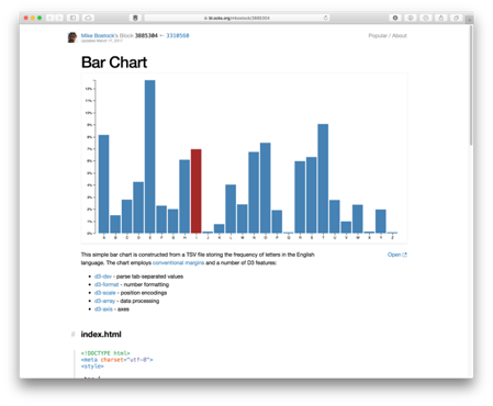
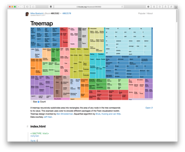
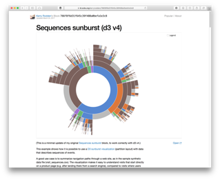
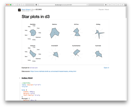
- Explore some D3.js examples
- Lab exercise: Node-link and Parallel Coordinates using PCAP file
- Continue with Assignment Task 2

